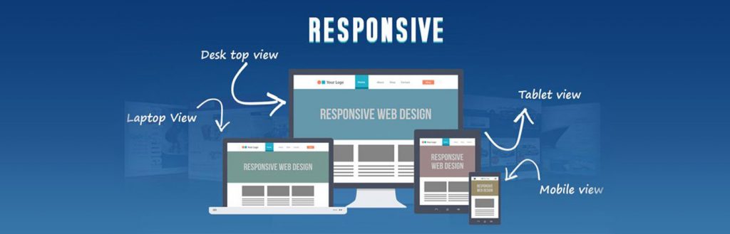
If you’re like most people, you spend part of your time browsing your favorite websites on your mobile phone, and part of your time viewing your favorite websites at your desktop and/or your tablet. Today, with most people owning multiple devices, it is imperative that your website looks good and works well, regardless of the device used to view it. This is why all sites must utilize responsive web design.
In other words, responsive web design is the practice of building a website suitable to work on every device and every screen size, no matter how large or small, mobile or desktop. Responsive web design is focused around providing an intuitive and gratifying user experience for everyone regardless of the device they use to access your website.
Using responsive web design means that the website should automatically switch to accommodate for screen resolution, display size, as well as browser and operating system capabilities. As you switch from your laptop to your iPad, the website should also switch and look great whatever the device. This means that the website should have the technology to automatically respond to your display and viewing preferences.
To explain further, three main principles come together to form responsive web design. These are:
- Fluid Grids
- Fluid Images
- Media Queries
We shall now explain these in detail. Traditionally, websites were defined in terms of pixels. However, when it comes to responsive websites, they are built with relative units like percentages, rather than with pixels. Using a particular formula you can calculate the percentage values. These values are then used in Cascading Style Sheets (CSS) by simply adding them to the width, margin and padding properties. These form what are known as Fluid Grids.
Fluid Images are so called because in a responsive web site, they shrink within the confines of a Fluid Grid. This can be done very simply with a single line of CSS code.
Media Queries are a CSS technology that have been available in browsers for several years, and they are a core component of responsive web design. Media Queries allow CSS to be applied only when specific conditions are met. For example, you can write a media query that will only apply CSS if the browser reaches a specific width.
Advantages of Responsive Web Design
Responsive web design has numerous advantages. Some of them are:
-
- Great Flexibility: Responsive websites are fluid, which means that the content flows freely across all screen resolutions and all devices. In fact, as discussed, both the grids and the images are fluid. This means that just as a liquid spreads to cover the allotted spaces, responsive websites do the same thing, with website content on a device screen.
- Enhanced User Experience: Responsive web design provides a superior user experience, regardless of whether you use a desktop, a laptop, a smartphone, a tablet or a Smart TV. No scrolling or resizing is necessary for any visitor to access a website from their favorite device.
- Cost Effective: With responsive web design, you don’t need multiple websites for multiple devices. The cost savings can be tremendous. Responsive web design buttress SEO results by directing all visitors to a single site, regardless of their device.
- Recommended by Google: Google recommends responsive web design. This is because responsive websites have one URL and the same HTML, which makes it easier and more efficient for Google to crawl, index and organize content. Google also prefers responsive web design because content that lives on one website and one URL is much easier for users to share, interact with, and link to, than content that lives on a separate mobile site.
- Easy to Manage: If you have separate websites for different devices, it’s very difficult to manage all of them. For example, if you have multiple devices, you need separate SEO campaigns. Also, it is difficult to maintain numerous separate websites.
If you did not have responsive web design, it can be an administrative nightmare. Imagine having to design and maintain multiple websites, one for each device. With responsive web design you eliminate this need and have only one website for multiple devices.
With more and more users worldwide using mobile devices and even smart TVs to access websites, responsive web design is the need of the day. It is estimated that the number of mobile phone users will reach 4.77 billion worldwide in 2017. Responsive web design may be able to keep you ahead of your competitors and increase market share.
Responsive web design helps you stay ahead of the curve. Learn more about responsive web design and enjoy using websites that have been designed using this technique. Here’s to great looking and great working websites…across all device platforms!
For more information on how you can build responsive websites for your business, contact LSN Soft at (425) 270-7096 or at info@lsnsoft.com.